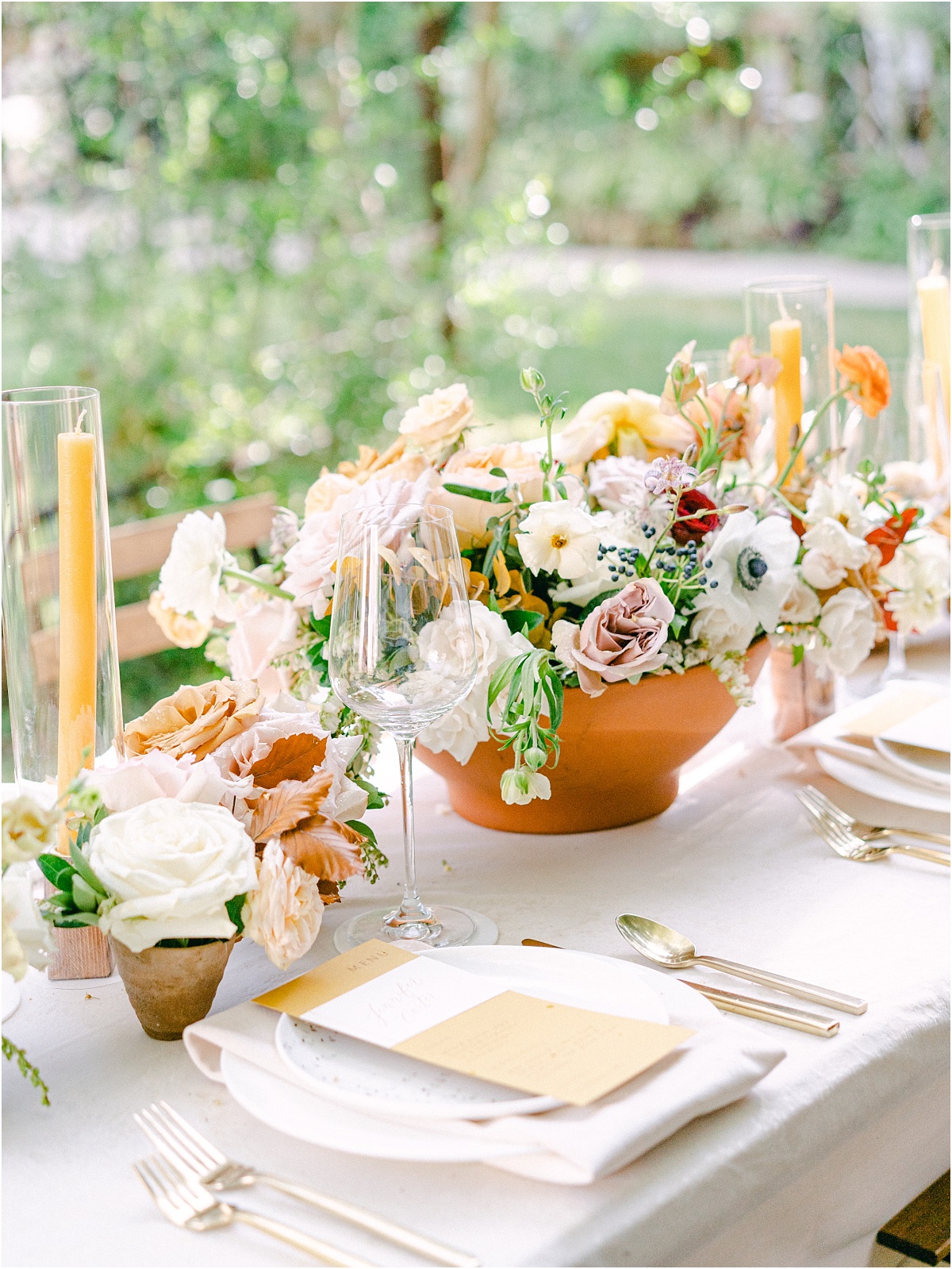
Daffodil Hill, Bethany Oklahoma
A Wedding Editorial and Fall Wedding Color Inspiration at Daffodil Hill.
I took a trip to Bethany, Oklahoma, and stepped inside a tranquil garden wedding venue called Daffodil Hill. I spent the afternoon amongst some of Oklahoma’s best wedding vendors who created an exquisite fall wedding color inspiration at Daffodil Hill.
As a professional wedding photographer, I believe a cohesive well-planned color palette carried throughout the wedding day is the single best way to elevate your wedding. The color story you choose will drive all the other decisions you make about your design elements from the florals, linens, invitations, bridesmaids dress, and so much more! A well-designed color palette will also make your wedding photos really shine. I always ask my brides to send me the color story of their wedding day. Then, I let that color story guide how I shoot, style, and create their wedding photos.
Here are some tips for creating your wedding color palette. And, let’s look at the fall wedding color inspiration at Daffodil Hill to see how it all comes together.
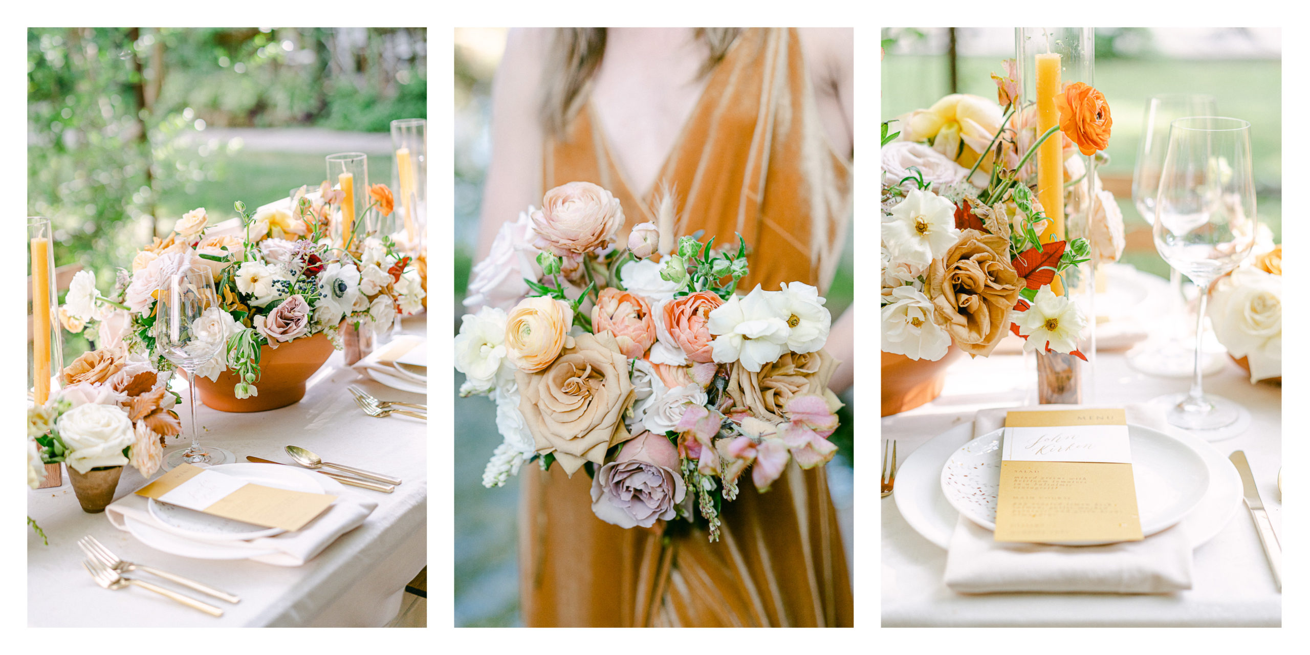
Consider the venue and get inspired by the setting.
Some venues have a built-in color palette with colored walls and carpet. It’s a good idea to consider these factors to avoid clashing with the surrounding you can’t control. Or, an outdoor venue with a blank canvas can be a skies the limit type of situation with a neutral base.
Consider the mood.
The color story will set the tone and mood of the wedding. Think about the emotions you want your celebration to evoke before you pick your palette—whether you’re going for a more relaxed daytime garden wedding or a regal ballroom affair. Color matters here!
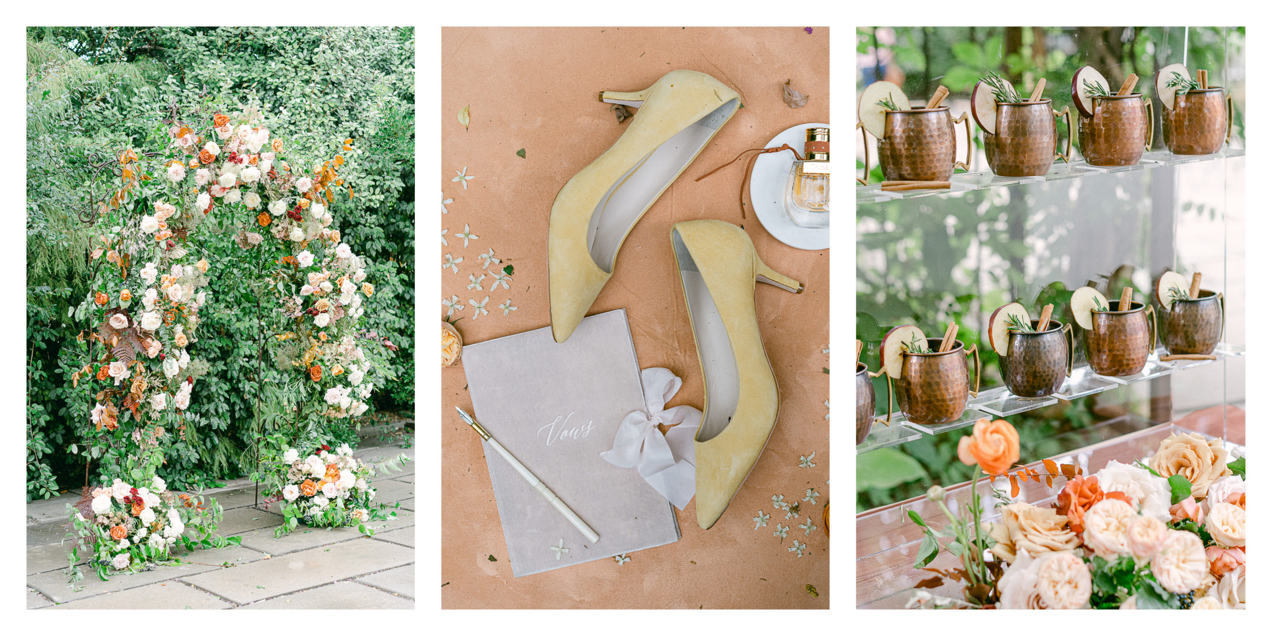
Choose a base color.
Your base color will be the most prominent throughout your wedding, and you can’t build the rest of the color palette without it. So, it’s important to choose a color you love!
Choose your accent colors.
Choose a handful of colors that compliment your base color – generally, three is a good number. These accent colors will round out your wedding palette and add dimension and variation to add interest. Consulting the color wheel is a great place to get inspiration for the accent colors. Generally, the colors that are opposites on the color wheel go well together and it pairs a cool and warm tone together. Or, try using neighboring colors on the wheel. These neighboring colors are similar on the color wheel and share a primary color.
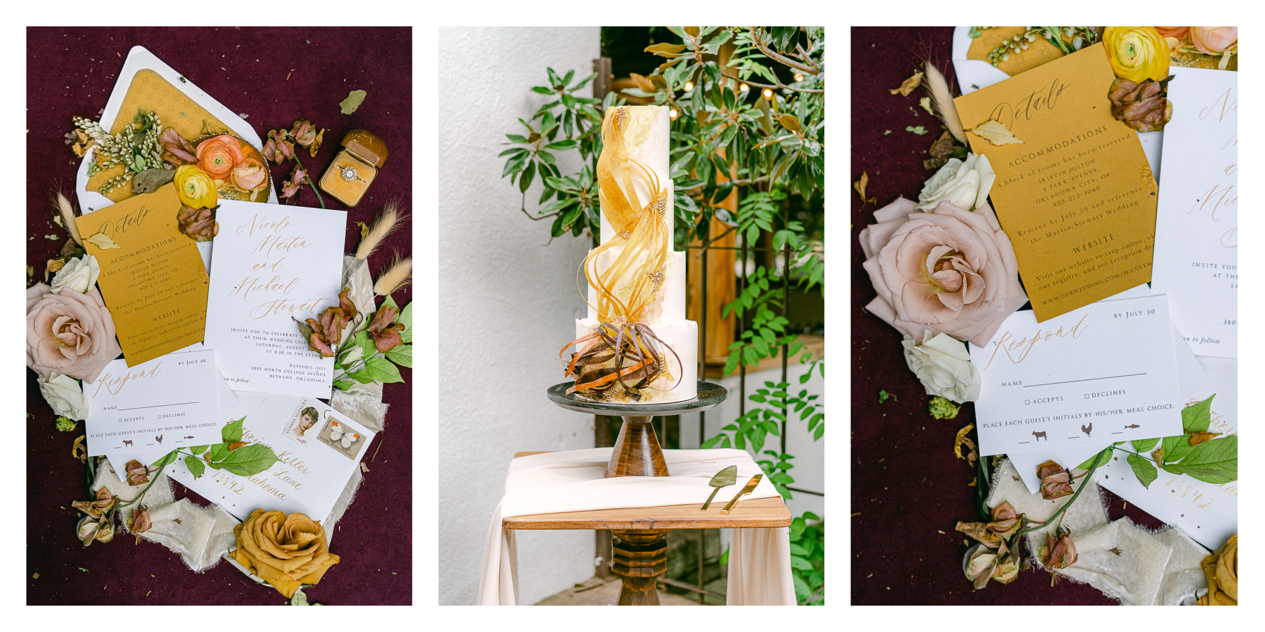
Carry the colors throughout the details.
Once you’ve chosen your colors use them to elevate your wedding with a cohesive color story woven throughout the details. Carry the color throughout your linen choices, florals, bridesmaids dresses, and the wedding stationary etc…
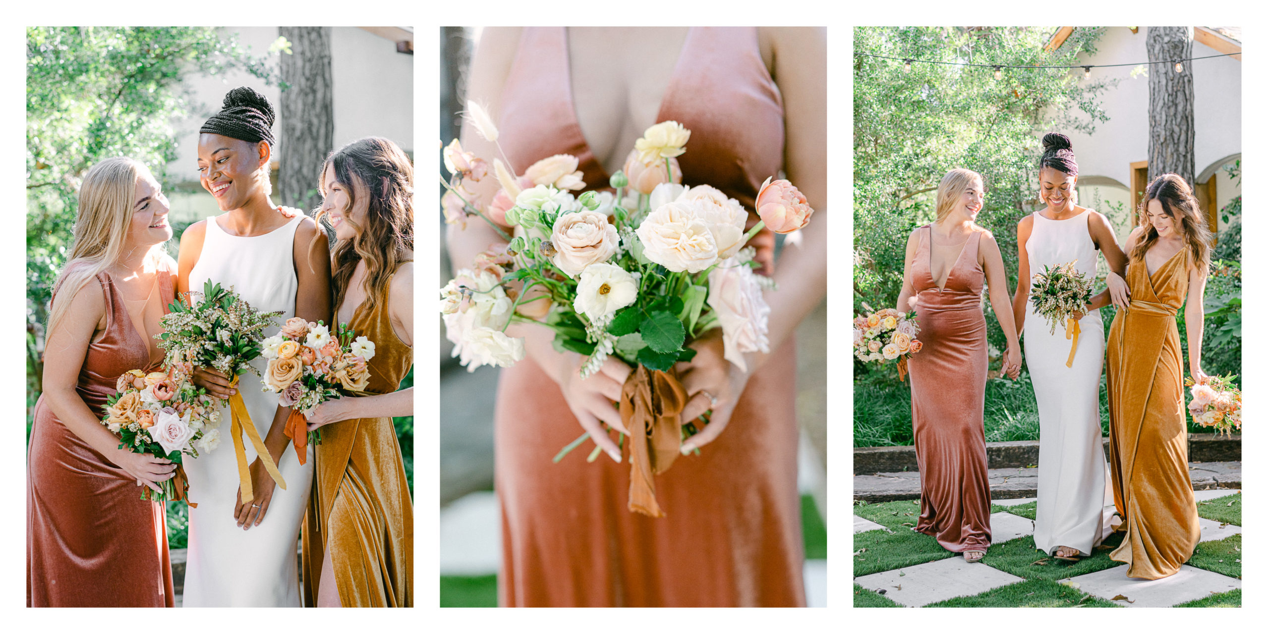
Share the color story with all your vendors.
Giving visual examples to your wedding pros gives them clear direction on your vision.
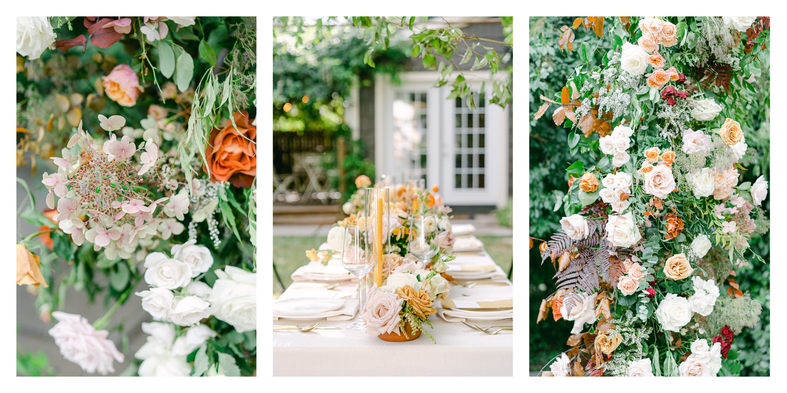
The Dream Team of Vendors
Photographer: Amy Odom
Venue: Daffodil Hill
Florals: Poppy Lane Floral Design
Day of Coordination: Throckmorton Events
Cake: Amy Cakes
Stationary: The Letter Box Shop
Dress: The Bridal Boutique
Bridesmaids Dresses: Bella Bridesmaids OKC
Mobile Bar: Bozza Van
Makeup Artist: Carolyn Flewelling
Hair Artist: Valerie Booker
Bride: @albreuna
Bridesmaids: @christaaadee & @brynlee_handy
Workshop: The Curated Exposure @thecuratedexposure
Amy Odom is a fine art Austin wedding photographer for the romantic at heart and madly in love. Now booking the remaining 2021 wedding dates.
Contact me HERE to see if your date is available!
Let's embark on this journey together where love, art, and time intertwine, leaving you with a legacy that will be cherished for generations.
Ready to work together?
Inquire Now
you love My work and you're
The List
Fusce orci purus, venenatis sed libero vitae, condimentum pellentesque odio. Aliquam semper semper justo, sit amet efficitur mauris tempor at.
